Welcome to maxwell.fyi
For Your Information
My name is Max Starkenburg. I'm a web professional from the US, currently based in Bremerton, Washington Houston, Texas Rancagua, Chile Mexico City Washington, DC.
My work has focused on harnessing HTML, CSS, JavaScript, and graphics editors to create intuitive, accessible, and aesthetic interfaces for large- and small-scale websites. See some samples of my previous work.
While my academic background is in architecture, all of my professional career, including summer jobs beginning in 1999, has focused on web work. More details in my résumé.
Learn more about how I made this website in the colophon.
Where to find me
Some other places you can find me online:
Feel free to contact me using this form, or just writing to max@maxwell.fyi.
Work samples
George Washington University: original website building and design
In my latest work, I've been involved the creation, redesign, and development of several Drupal-based web presences for George Washington University Libraries & Academic Innovation. These show some of what I've worked on at GW.
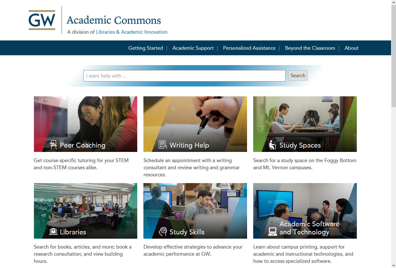
Academic Commons
Responding to a need to provide a central hub that connects students to the variety of available but disconnected academic services and resources, the Academic Commons was created.
In helping to build its web presence, I:
- mocked up multiple design possibilities
- wrote custom Drupal 8 theme code (including Sass stylesheets, JavaScript interface features, Twig templates and Drupal hooks in PHP for custom appearances and behaviors)
- created a custom Drupal module to support requirements in the admin interface
- researched, installed, and configured other Drupal 8 contributed modules for interface and content-editing needs
- configured Taxonomies, Content Types, and Views to ease future site maintenance
- conducted multiple rounds of QA testing and assisted with debugging
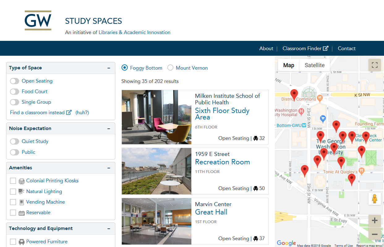
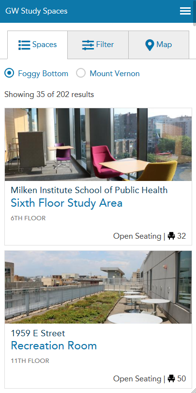
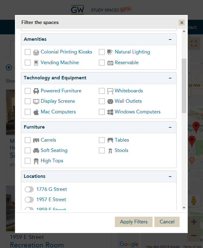
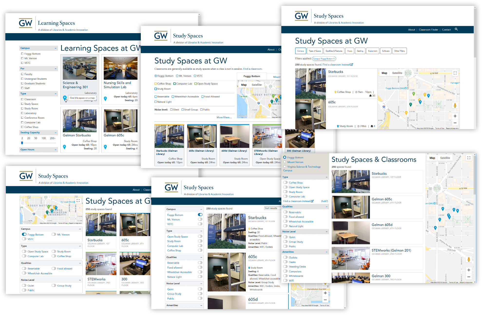
Study space finder
Allowing students to find study spaces all over GW campuses, our department built this website, using it as an opportunity to start getting our hands dirty with Drupal 8.
Given the complexity of features, data, interactivity, and other variables involved, I was proactive early on in marshaling requirements and wishlists from a variety of disparate stakeholders, including students, developers, content editors, and managers. My efforts provided groundwork for requirements specification, scope and sprint planning, database design and maintainability, and interface design, dramatically decreasing the number of unknowns that otherwise would have plagued implementation and delayed deadlines....
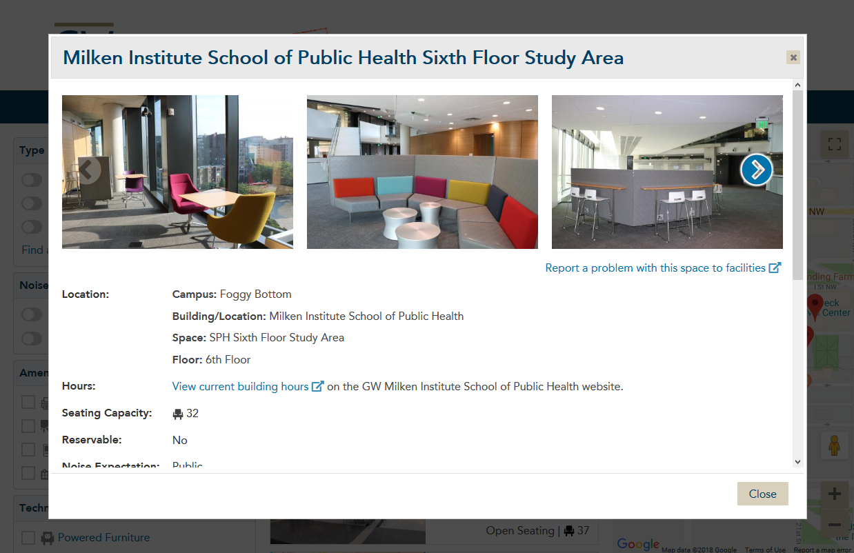
... Besides leading the visual design, I:
- created functional mock-ups (some seen in image at right) to run usability testing on individual micro and macro aspects of the interface with students and other stakeholders
- designed and coded the interface to make sense at a variety of responsive sizes
- created original icons for quicker filtering
- integrated and customized JavaScript libraries for features like information dialogs, image carousels, and lightboxes
- used the Google Maps API to override default functionality as needed
- dipped my toes into AngularJS and PHP to fix issues
- ensured accessibility was written into the code
Library website modernization
In addition to writing CSS and JavaScript to bring the Drupal 7 site into line with the university's more modern and less crowded look-and-feel, I designed and coded new components to break up the text-heavy design of the old site (seen at left) and restore focus and ease of navigation to our most important and sought-after services via design elements that tested most successfully in the usability studies we ran.
The new design led to an increase in new catalog searches.

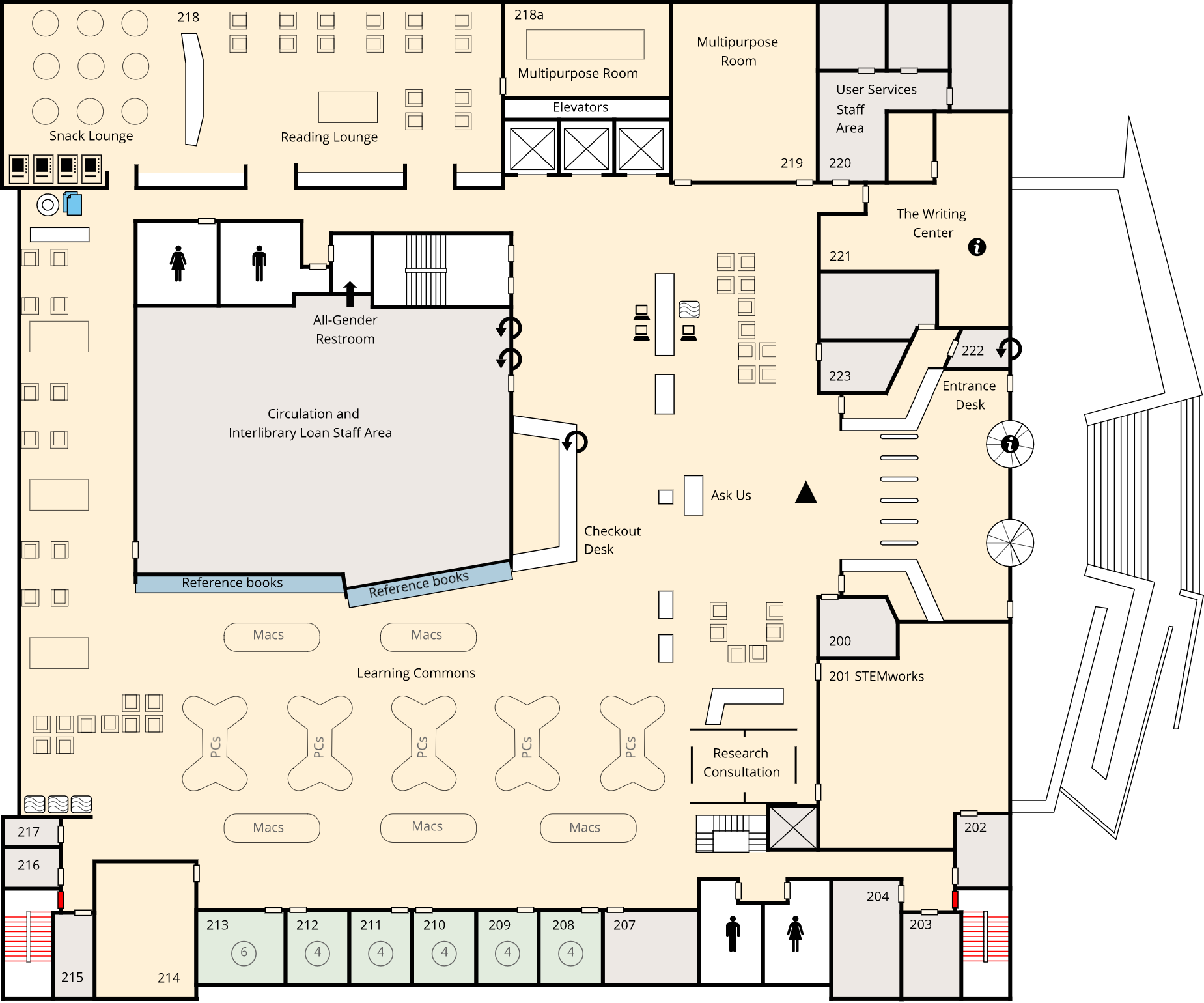
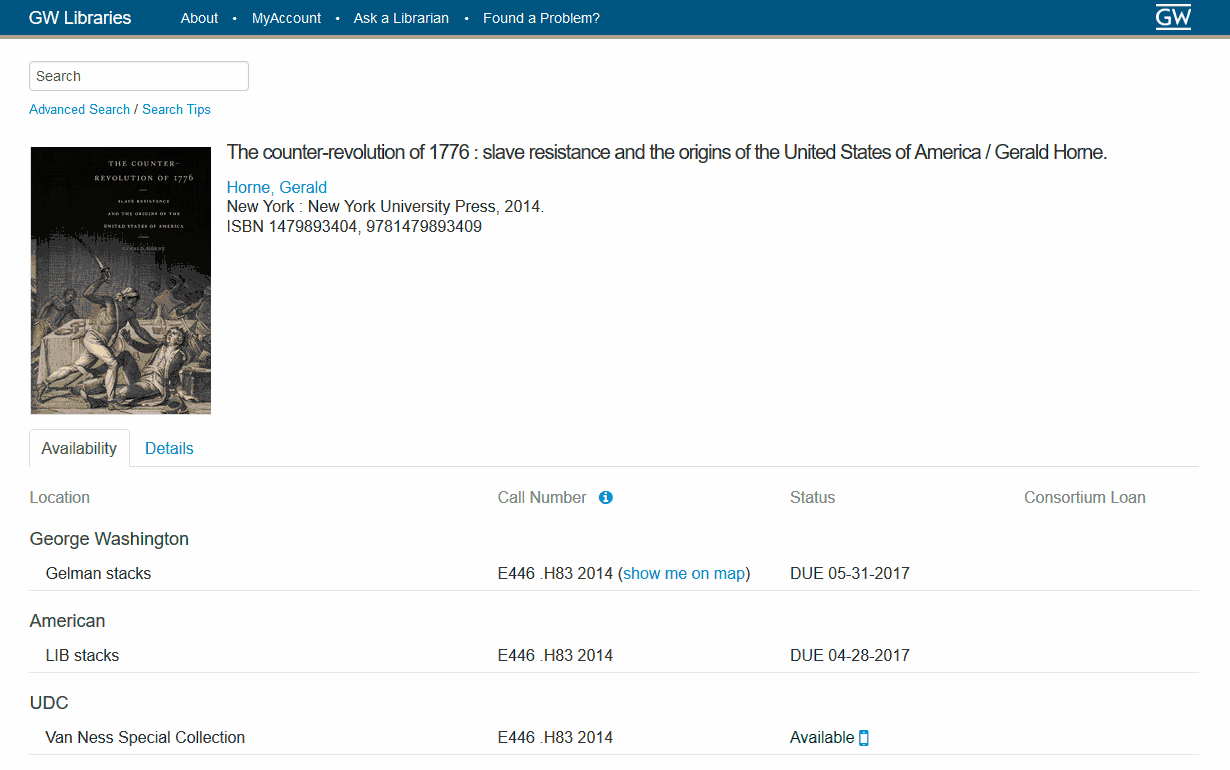
Interactive floor maps
At GW, I also created interactive floor maps (with SVG and JavaScript) to ease finding books by their call number.
Visit the maps
In addition to being able to mouse over the maps and have information about buildling features appear, the maps were built to allow for users to click a link next to the call number in the catalog and be directed to exactly where in the building their book is located.
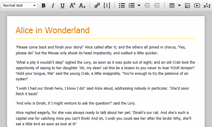
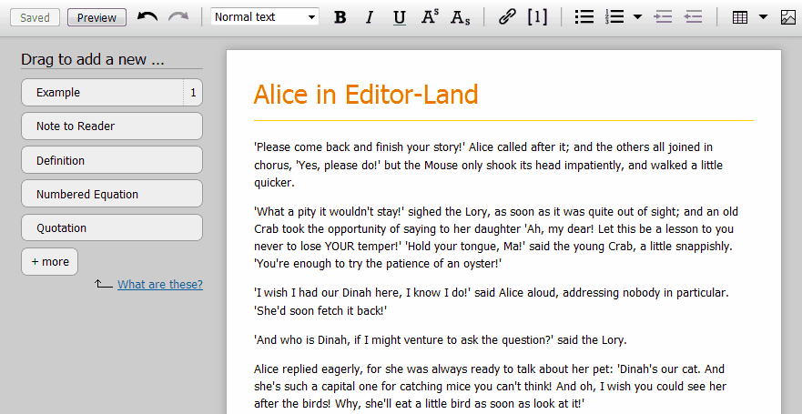
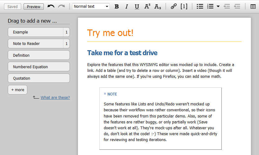
Online textbook editor: examples of features
I made functional mock-ups of a web-based WYSIWYG editor (a WYSI-what?) from scratch, which guided the software development and were used for all usability studies (I'm proud to say that some subjects were surprised they weren't the real thing). Each component had multiple technical and UI "moving parts" to juggle (drag-and-drop, handling Range/Selection of contentEditable text, contextual help, menus for advanced options, "nudging" features, redundant workflow expectations, etc.). Below is a sample of some of the interfaces, each of which went through various iterations.
Math mini-editor
Displaying math on the web is tricky, let alone editing it. This widget incorporated the JavaScript built by the good folks at ASCIIMath, which converts a simple mathematical mark-up language to MathML. As the user writes ASCIIMath in an in-place miniature editor, the output display is produced in real time. A "cheat sheet" was built to show common encodings.
Accessible and attributed images
An important aspect of the editor was nudging authors to include text for the benefit of users who rely on screen readers, as well as to provide attribution for the image's creator. Both of these aspects were tightly woven into the workflow.
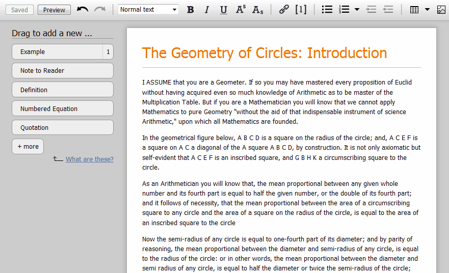
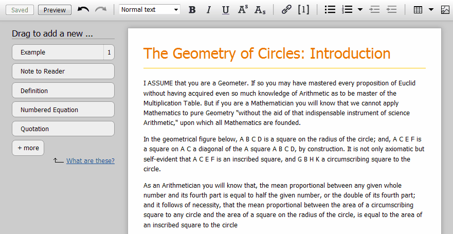
Textbook elements that talk to each other
A key question of the editor was how to add semantic elements like Examples, Exercises, Notes, Equations, etc., that would not just share a respective format, but provide features like automated numbering, automated index generation, answer sets, and collated glossaries. These animations show three different ways an author could add a Definition to their text. Subtleties of their functionality were the subject of multiple usability studies. Read a report of one here (PDF).
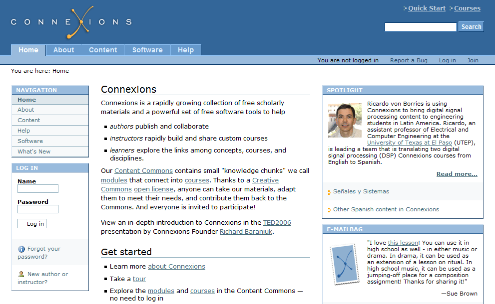
Connexions: educational repository and authoring environment
I was the lead visual designer at Connexions (now OpenStax CNX) for over 10 years. Aside from setting general graphic guidelines, I worked on mocking up ideas for every new feature that involved the user interface.
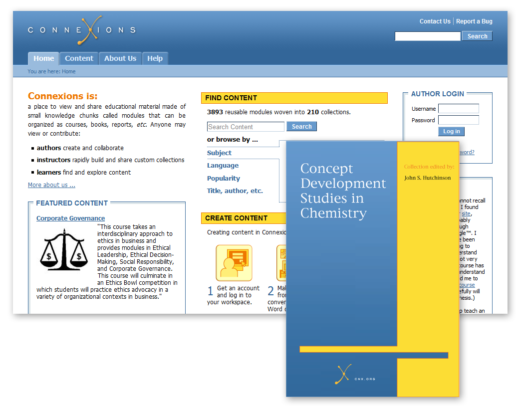
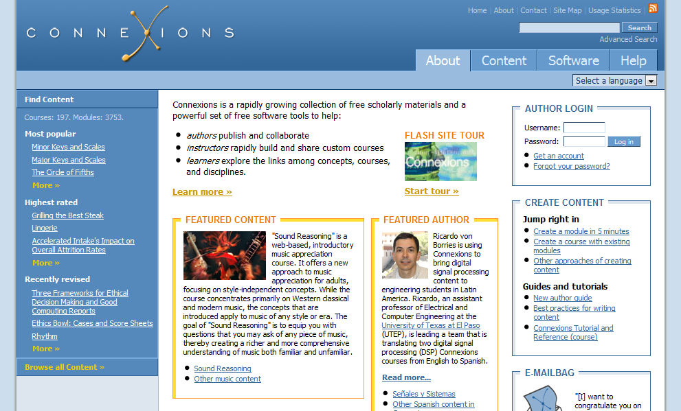
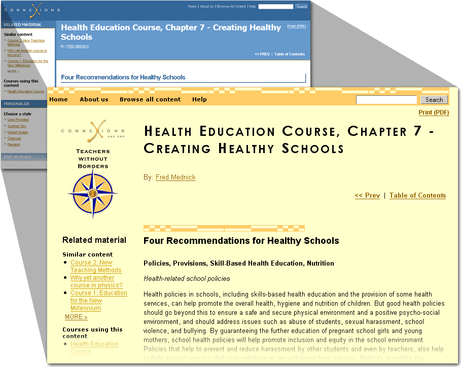
I: Connexions homepage (the early years)
For the longest time, the homepage of Connexions, a repository and authoring environment of open educational resources, didn't alter in style from the default CMS underlying its architecture. Some changes in colors spruced things up a bit, but didn't resolve the problem of being too reliant on text and subject to peculiarities of the CMS....

II: Redesign iterations
... When resources could be put to use for a substantial redesign, usability expert Manpreet Kaur and I worked on several drafts, using the homepage as a base while being careful to take into consideration how any design decisions would affect the rest of the site's navigation....
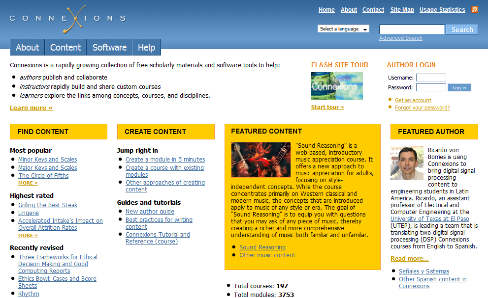
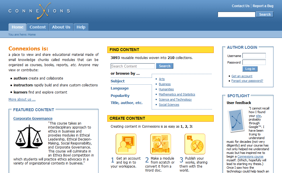
III: The final design
... The redesigned homepage gave stronger visual clues with regard to where to focus the eyes and what the various elements represented. Since Connexions's software was also open source, the new design intentionally stayed closed to the underlying architecture, leaving it flexible for further adaption and maintenance. (Note: OpenStax CNX has since undergone an entirely different design to reflect its new name, direction, and architecture.)
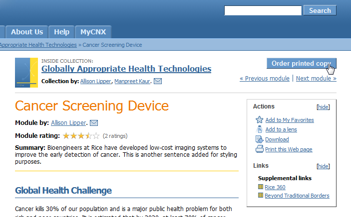
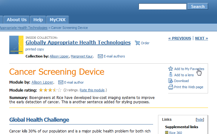
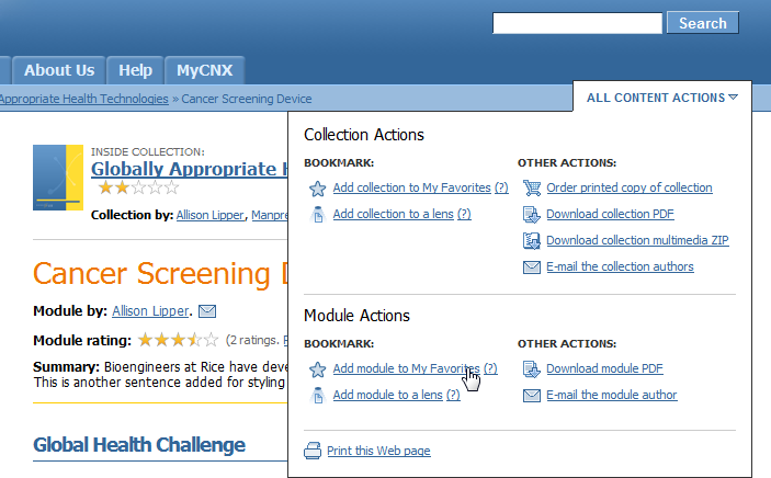
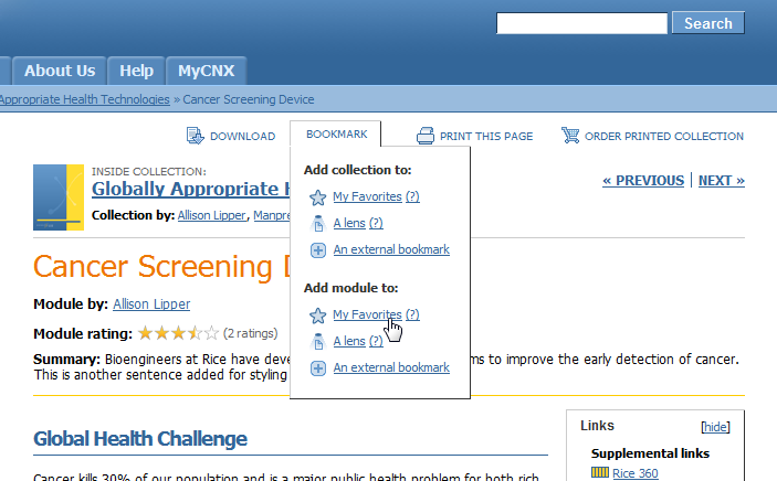
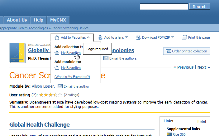
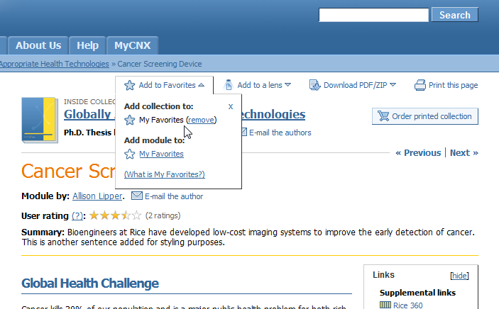
Iterative ideas
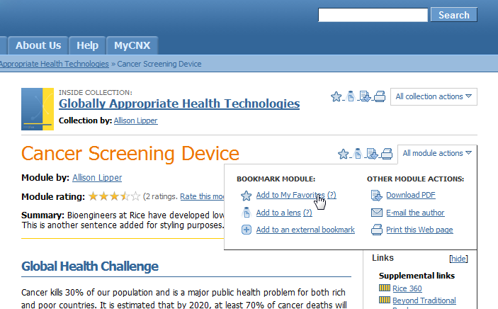
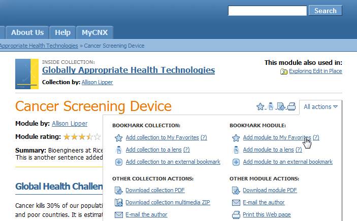
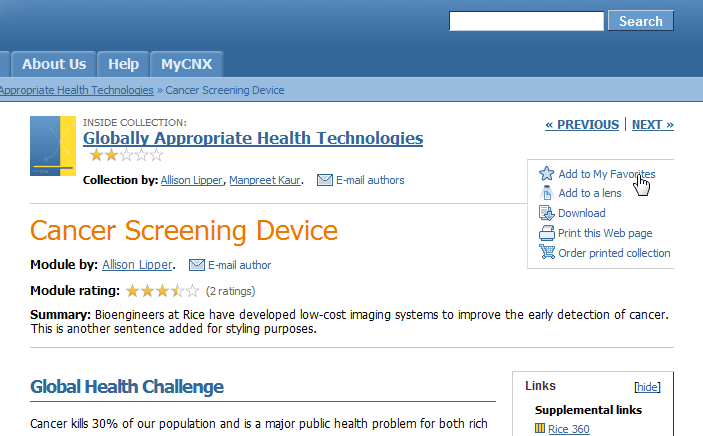
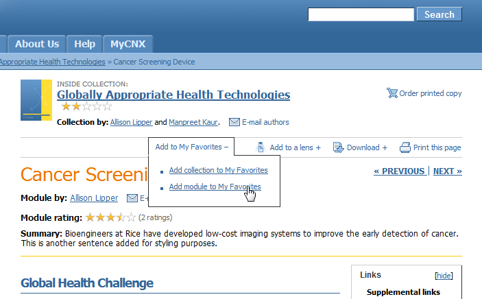
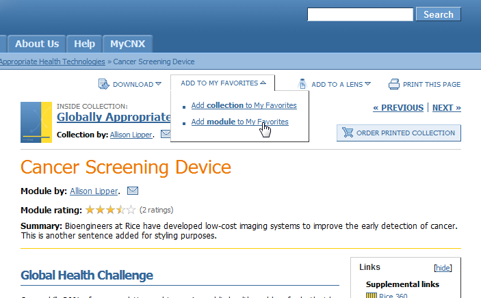
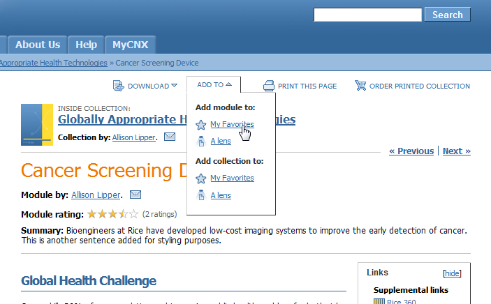
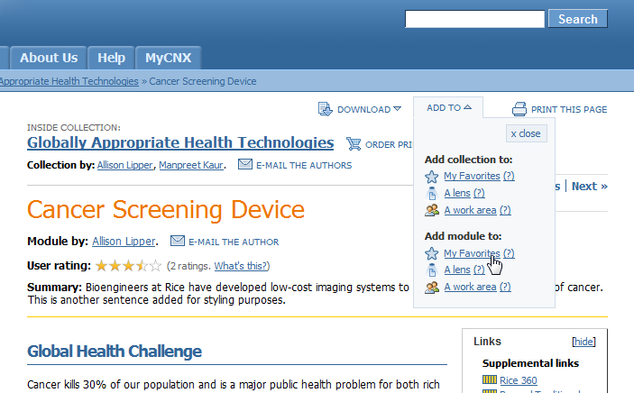
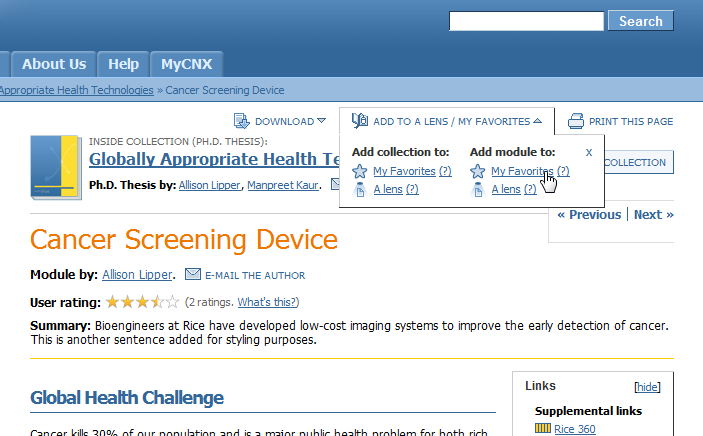
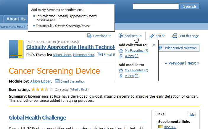
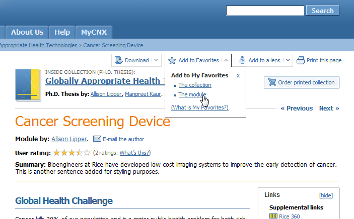
How to add options on a webpage to download its PDF, download its ZIP, add it to various bookmarks, send it to the printer, order a printed copy, rate it, e-mail its authors, edit it, all for two levels of content (the current page and its container)? All while making such options compact, easy to access and understand, and flexible for future features? These are just a small fraction of the ideas mocked up to tackle such a challenge.
Print-on-demand covers
The brief: to design a cover that could be generic enough for any type of content, be flexible enough to allow long titles and long lists of authors, be branded to Connexions, and be visually interesting. Like most of my other work at Connexions, I played with a variety of layouts before a final choice was decided by a larger team with my input.

Re-skinnings
Much of my work has focused on completely changing the look and feel of a website while leaving the underlying architecture relatively intact.
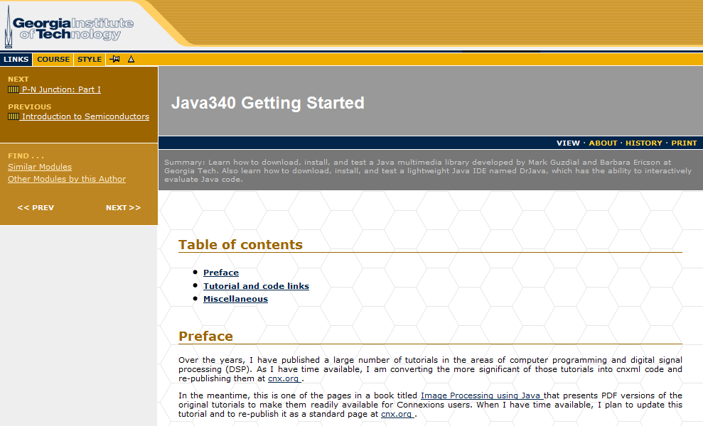
Rice archive re-do
Rice's Digital Scholarship Archive was using the default DSpace installation with some basic styling. My upgrades not only included a rebranding, but also several structural changes via XSLT to improve the user experience by making the site more intuitive to navigate....
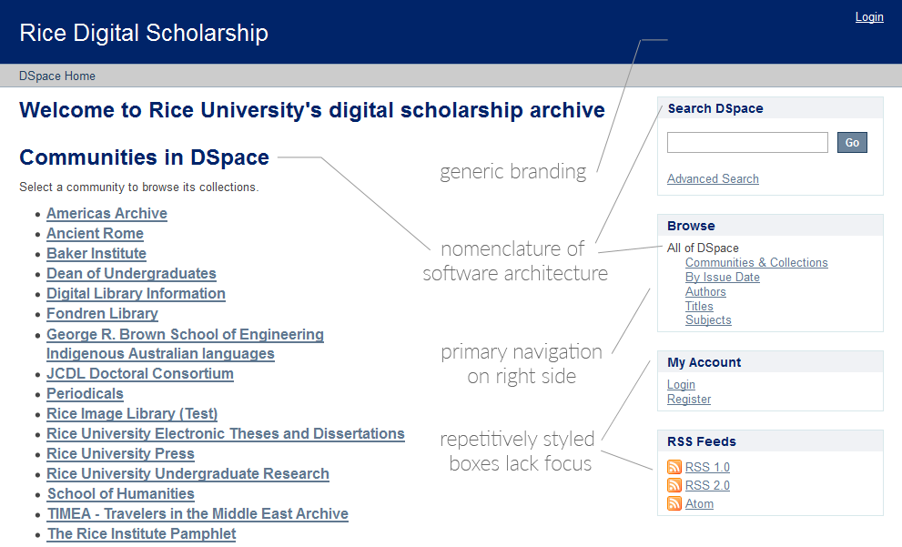
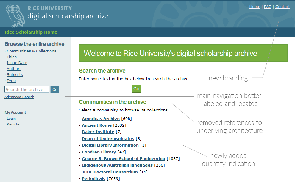
... In addition to primary navigation being in a problematic location, there were many references to the underlying architecture (DSpace), as well as navigational elements relying solely on nomenclature. I sought to improve these issues with increased contextual clues and to make better use of "above the fold" vertical space.


Custom styles for co-branding
These examples show how I altered, entirely with CSS, pages in the Connexions repository so that their styling matched the websites of external groups....
.... This separation of styling from the semantics of the content was one aspect of Connexions's ability to output in multiple formats, including PDFs, EPUBs (whose reformatting I worked on), mobile (for which I created a pared-down stylesheet) and print-on-demand books (whose covers I designed)....
... While in many cases maintaining these stylesheets proved prohibitive, they were frequently a contributing factor in adopting usage of the Connexions repository.
Connexions custom styles
In addition to matching external groups' styles, I also created stylesheets just for user preference or internal use. The biggest challenge they presented was making them flexible enough to work with a great variety of user-entered content. No dimensions of content could be taken for granted.
Static websites
A few of the examples of small-scale basic websites, some completely from scratch, I have designed over the years.
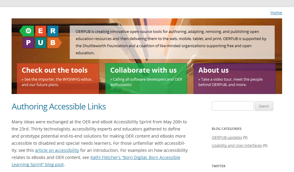
OERPUB homepage
The WYSIWYG editor project I worked on needed a front page to show off what it was about. There was an existing WordPress site, but it was the default style and lacked the right structure for new visitors and potential collaborators. With installation help from developer Marvin Reimer, in a few days I did a complete rehaul of the style, designed a new logo, installed new plug-ins, and populated the content, giving the site new life.
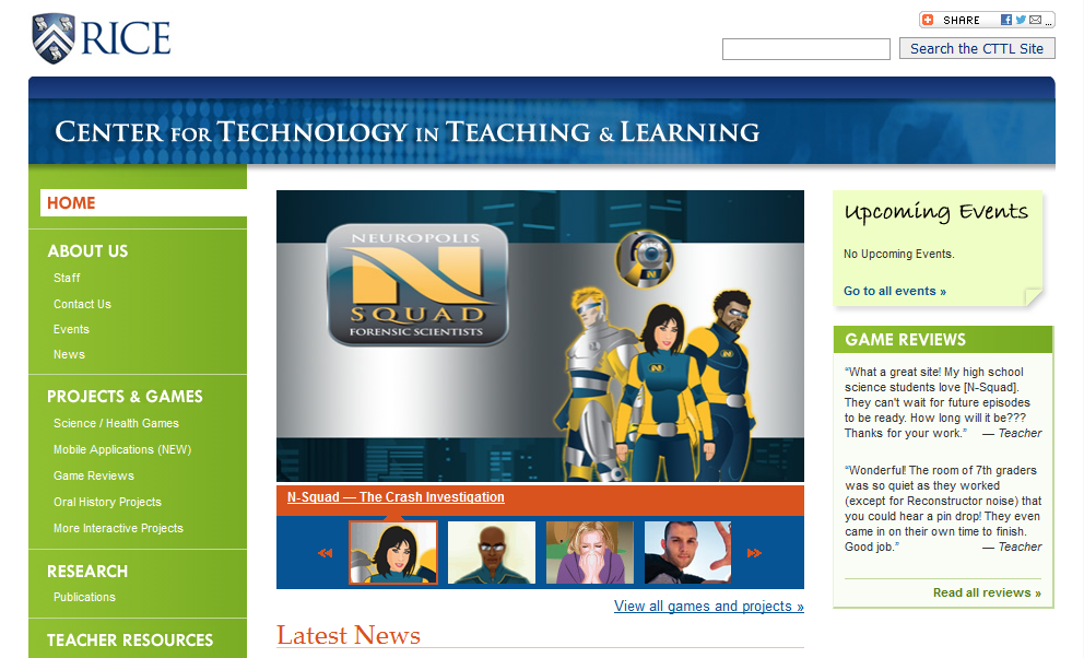
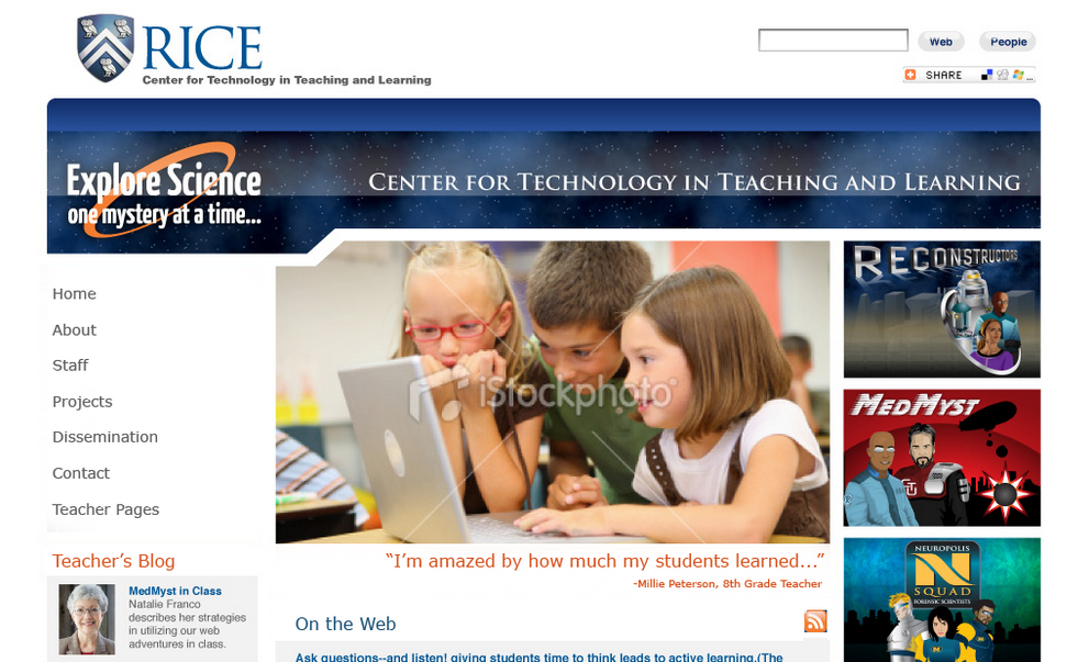
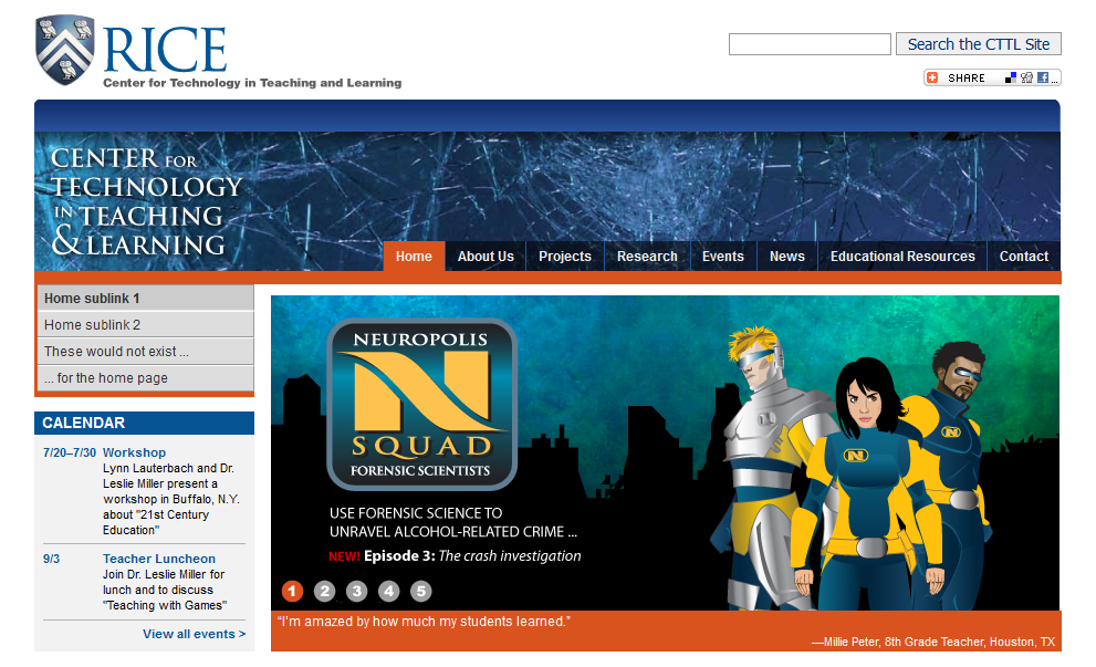
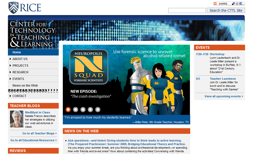
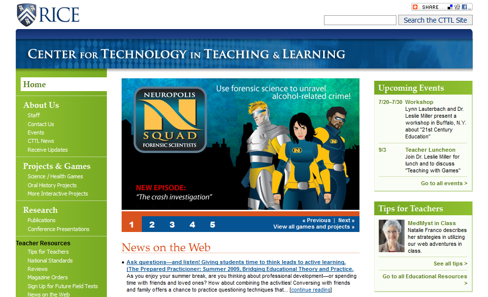
Center for Technology in Teaching & Learning
CTTL, a Rice University center that designs interactive games for young students, sought to give their website new life and to meet Rice's guidelines for branding of its sub-pages, while also maintaining a distinct look and feel. The redesign, done in collaboration with Francisco Perez, started with a card sorting session, and ended with training the staff to update the content we had populated into the new CMS.

"Rejected" designs
The site design went through several iterations before arriving at its final design.


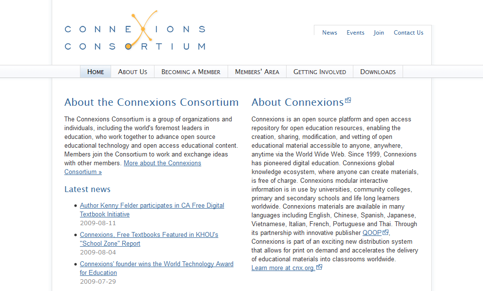
Connexions Consortium
Connexions, my primary employer, needed a simple yet attractive website for its associated consortium members and prospective members, one that could grow as needed without redesign. I designed and built the site in roughly a week, with a simple backend for logging in provided by Ross Reedstrom.
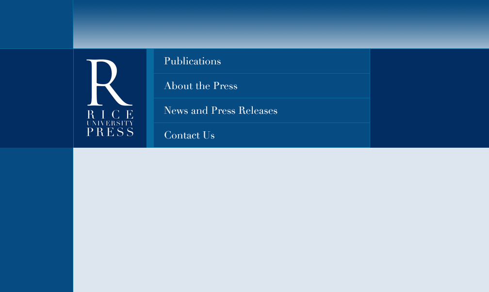
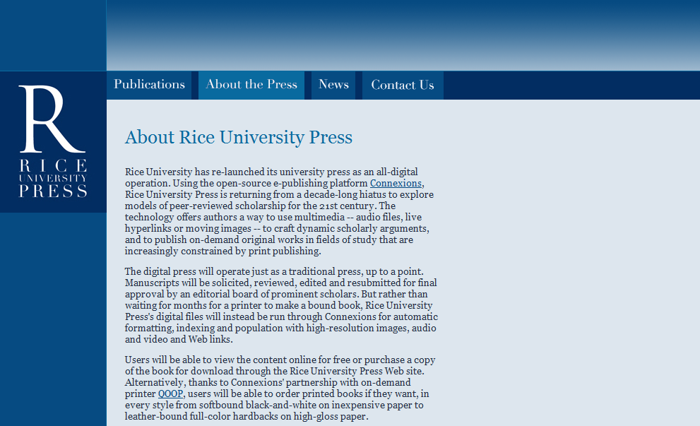
Rice University Press
During the years when Rice University Press made a revival, I was tasked with designing their website. I sought to make an elegant design that was in keeping with Rice's branding while remaining distinctive.
Book-related projects (coding for fun and non-profit)
I like books. A lot. I like to browse them, rearrange them (that rainbow of shelves used to be my living room), hunt them down, buy them, catalog them. Sometimes I even read them. I've also done some book-related coding, mostly in the form of user scripts (what are those?) for LibraryThing, a cataloging site for book lovers. These scripts help the site's users get things done much more efficiently. (See all my scripts here.)
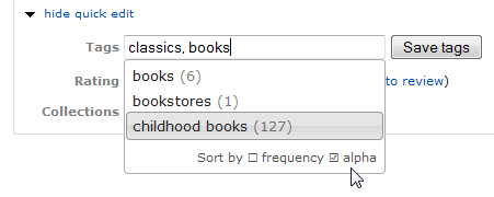
Tagging autocomplete
This script allowed users to select their previously used tags from a dropdown, a long-requested feature to make tagging more internally consistent. It's one of my proudest scripts, because not only did it serve as proof-of-concept for later incorporation into the site for all users, it also required learning about things I hadn't had much experience with up to that point, such as XMLHttpRequest/Ajax, localStorage, jQueryUI's autocomplete, regular expressions, and performance testing.
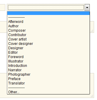
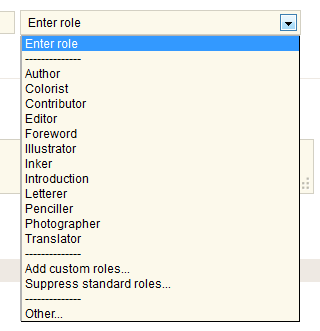
Custom author roles
LibraryThing has a default set of roles you can choose from when cataloging your books (author, illustrator, editor, etc.). But if you happen to frequently use a role that's not on the default list, it's a pain to select "Other..." and type it in each time. This script allows one to change which roles appear by default. Since at the time LibraryThing wasn't using jQuery, I took many of the scripts as an opportunity to beef up my native JavaScript chops.
Reply preview
LibraryThing's social forums have a built-in mechanism for quickly linking to previous posts, but when you click on them, you tend to lose your place. This script makes a small copy of that referred message and reproduces it in a tooltip right where you are.

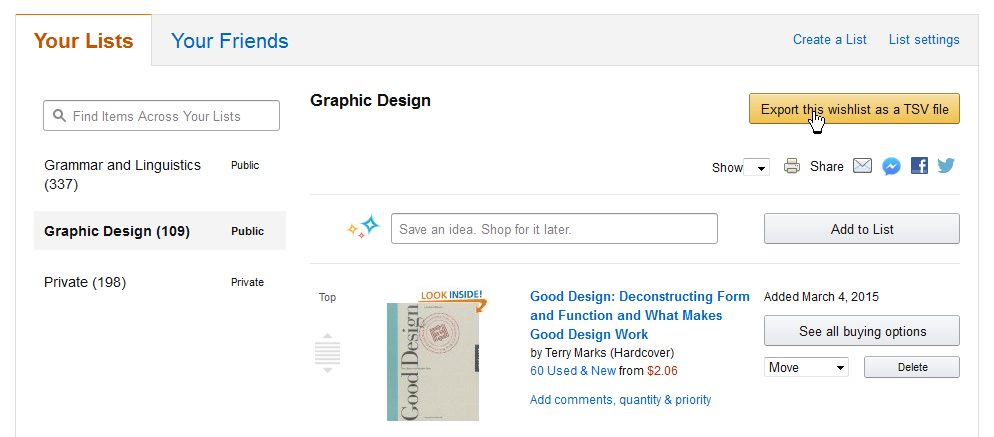
Amazon Wishlist Exporter
Not all of my scripts are for LibraryThing. This one I made after some frustration with Amazon removing the names of some items from my Wishlists. Now I can just click on the new "Export" button and quickly save a local copy of the list.
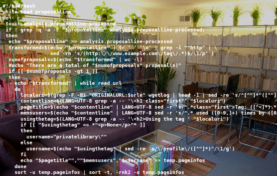
Shell/gawk scripting
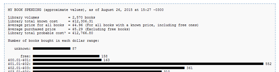
Nor are all of my scripts user scripts. My first shell script was used to add up how much money I had wasted spent on books over the years, and display a histogram of the distribution. You can see the full script on GitHub.
Résumé
What I can do for you:
Translate your conceptual goals into digital deliverables by building intuitive interfaces with clean, robust, accessible code and aesthetic visuals.
I can be counted on to bring my:
- Strong advocacy of user needs.
- Collaborative, detail-oriented, and holistic approach to problem-solving.
- Two decades harnessing the capabilities of HTML, CSS, JS and related web technologies (four years in Drupal). Whether the job calls for a Bash script, an Illustrator design, or anything in between, I will proactively seek out the best solution to help make your product successful.
Personal portfolio: https://maxwell.fyi
LinkedIn: /in/max-s | StackOverflow: /users/5285945 | GitHub: /maxstarkenburg
Work Experience
George Washington University
Web Designer | Libraries and Academic Innovation (GWLAI) · 11/2016–present
- Led or guided all steps of the lifecycle of GWLAI's four Drupal 7/8/9 websites, focusing on enabling content editors to promote academic resources while reducing development bottlenecks, unknowns, and costly retrofitting, by:
- Building interactive and responsive mock-ups, based on participation in requirements gathering and project scoping, for usability testing and stakeholder feedback
- Configuring sites and evaluating Drupal contrib modules to support user stories
- Writing custom D8/9 themes and modules using CSS/Sass, Twig, JS/jQuery, 3rd-party libraries and APIs, and PHP development, reviewing all work for conformance to WCAG
- Reviewing code written by the senior web developer, managing regression testing, and helping to streamline workflows for Git, Composer, and config management
- Maintaining sites with Drush and custom Bash scripts, and consulting on server migrations
- Built SVG floor maps made interactive with JS to help users find a book on the physical shelves by linking from catalog results to highlight the book's location on the maps
- Collaborated with colleagues across the organization to meet their content-creation needs, consulting on a11y best practices, graphic design, and CSS/JS incorporation in their projects
- Taught workshops for students, staff, and faculty on Adobe Illustrator and HTML/CSS
OERPUB (publishing initiative for open educational resources)
Interaction Designer · 12/2011–04/2014
- Scripted high-fidelity and functional mock-ups from scratch for an online WYSIWYG textbook editor, quantifying the relative success of the editors interactive features via multiple usability studies using the mock-ups themselves
- Created original open-source vector-based icon set, designed logo, and made plug-in and theme customizations for the initiative's WordPress site
Rice University
Designer and XSLT Developer | Digital Scholarship Services · 11/2010–04/2011
- Customized the university’s digital scholarship repository in DSpace using XSLT to provide seamless branding and intuitive navigational access to thousands of research items
- Fixed XSLT errors and added requested features to the output of 500 XML documents
Web/Graphic Designer | Connexions (now OpenStax CNX) · 01/2001–04/2011
- Led visual design on an open educational repository and authoring environment of over 18,000 pages, 2,000 users, and 1.6 million monthly visitors
- Iterated over design ideas (2,200 mock-ups in total) as needed by the team for new features such as search/browse interface, social media plug-ins, co-branding designs, user profile pages, authoring interface, homepage redesign, and tag editing/display
- Assured high quality of software by conducting thorough tests each release cycle
Education
Rice University · Houston, Texas
Bachelor of Arts · Architectural Studies · 2003
Additional Experience and Info
- Conferences attended: DrupalCon North America 2018-2021; Drupal GovCon 2018-2020; BADCamp 2020; AccessU 2019; regularly attend DC-area Drupal Meetups
- Courses taken: Half-day and full-day trainings on ES6, React, PHP programming, and Drupal module development (Debug Academy); Composer (DrupalEasy); Drupal migrations (Agaric); Section 508 and WCAG 2.1 (Knowbility)
- Language: Upper intermediate proficiency in Spanish, both written and oral (ILR 3, CERF B2)
- Cross-cultural experience: 2 years residency with remote work in Chile and Mexico (2015-16)
Colophon
The making of
I used Jekyll and few other Ruby gems to be able to make the site bilingual without code duplication (I used to maintain the site en español también), write the CSS in Sass, and keep around old designs of this site with ease (see version 1, you're on version 2, see version 3). The code is version controlled in Git, usually written from an Ubuntu VirtualBox, pushed to the origin repo in BitBucket for safe-keeping, and pushed to another remote repo on my web host where a post-receive hook in Bash builds the generated HTML and other assets. Professional education and efforts in the realm of web accessibility, mostly after originally building out the site, and my attempts to remediate its numerous issues since (still a work in progress), have given me a newfound appreciation of what a costly and misguided notion it is to try to retrofit a11y ex post facto. I've tried to ensure responsive styling with each design, and had fun in some past iterations with animated SVGs and CSS.
Except where noted here in the colophon and in a few code comments, everything was coded by yours truly from scratch.
Under the hood
In addition to some JavaScript from jQuery, Velocity.js, and Bootstrap (for its scrollspy functionality), this site configures Magnific Popups and Colorbox for the lightboxes, uses the Raleway typeface (hosted on Bunny Fonts), Formspree to create a non-PHP contact form, Let's Encrypt for the SSL certificate, and some icons by Open Iconic and Icon 54. I used ScreenToGif to create and gifsicle to optimize the animations of work samples. Background image of leaf originally by Eric Gaba, licensed under CC-BY-SA 3.0 Unported. The following tools were also of great help: Eric Meyer's Color Blender (finds midpoints between hex colors), regex101 (regular expression tester and beautiful headache preventer), and Can I Use? for browser compatibility info.
Let's get in touch
Have a question, concern, job for me? Just wanna say hi? Go for it ...
